

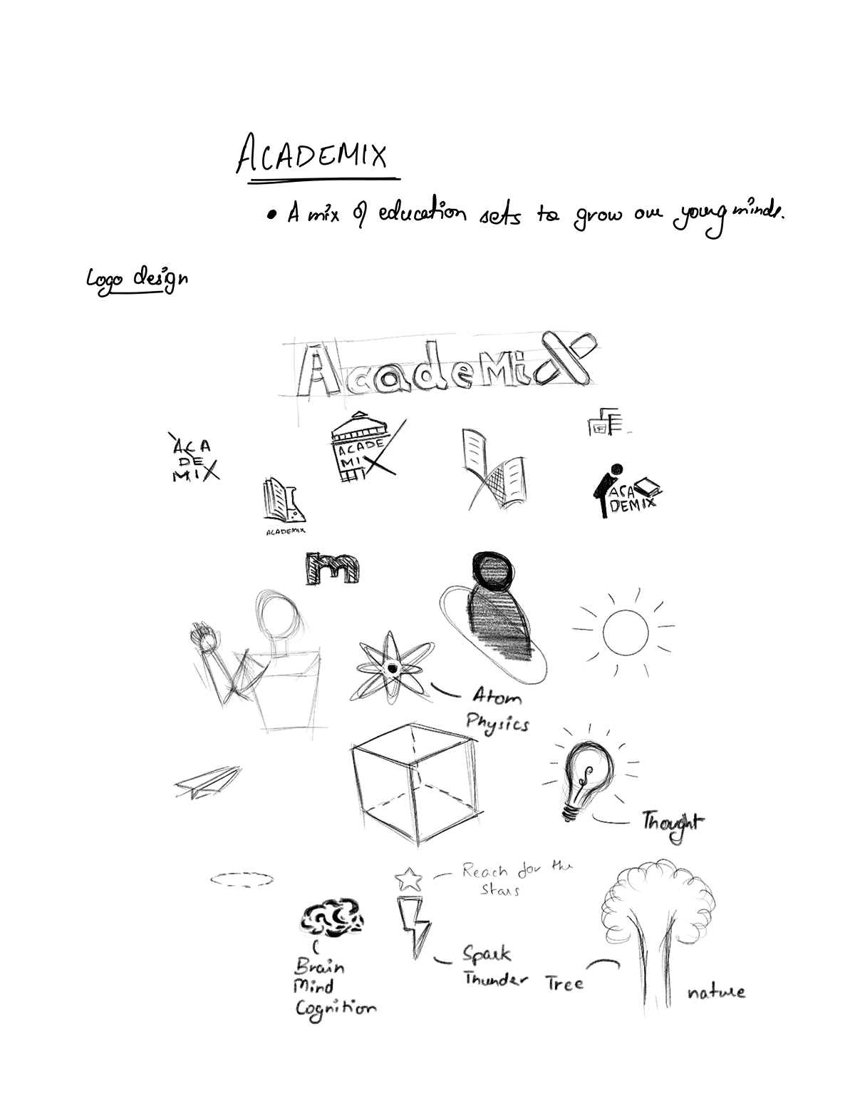
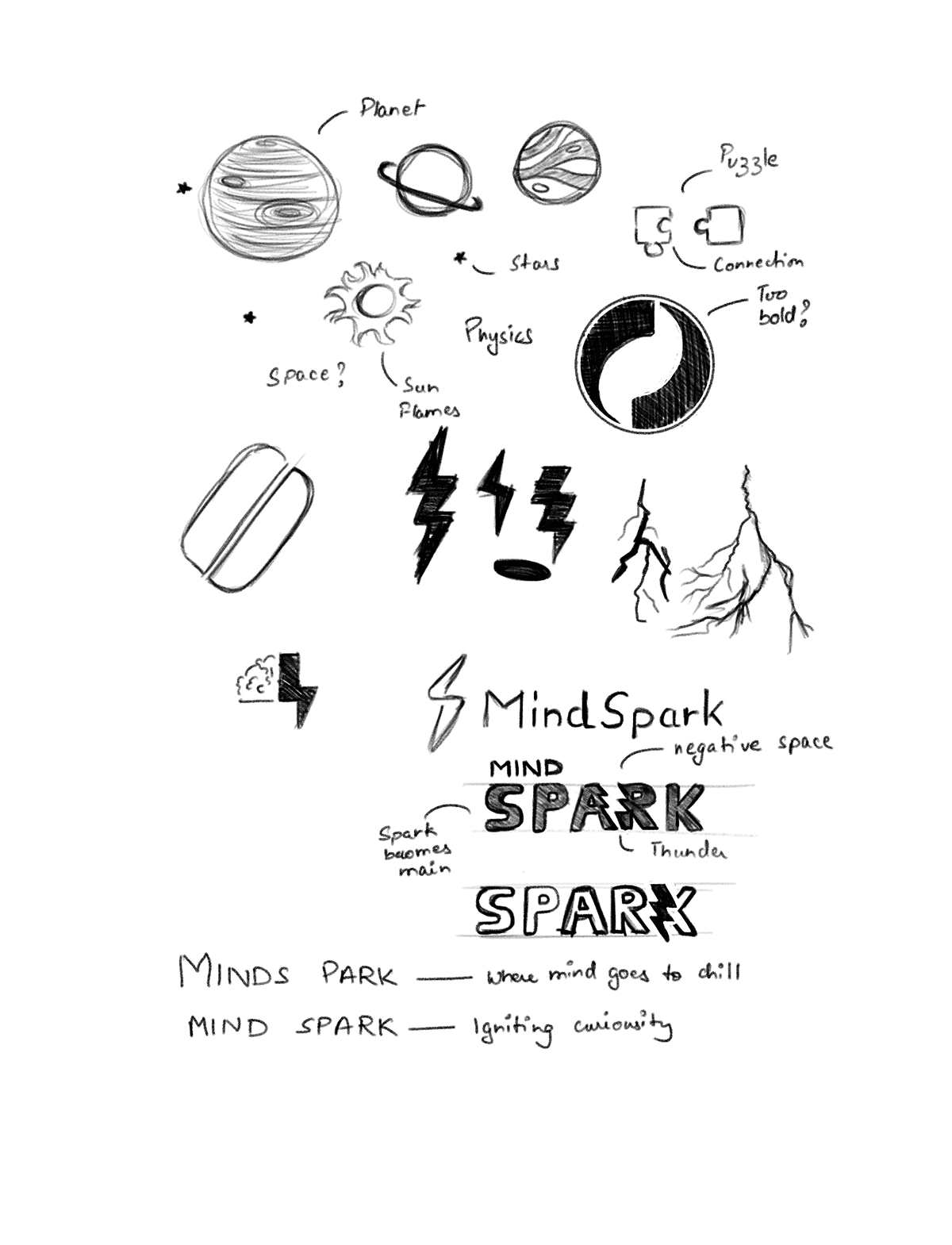
LOGO DESIGN
Logo design
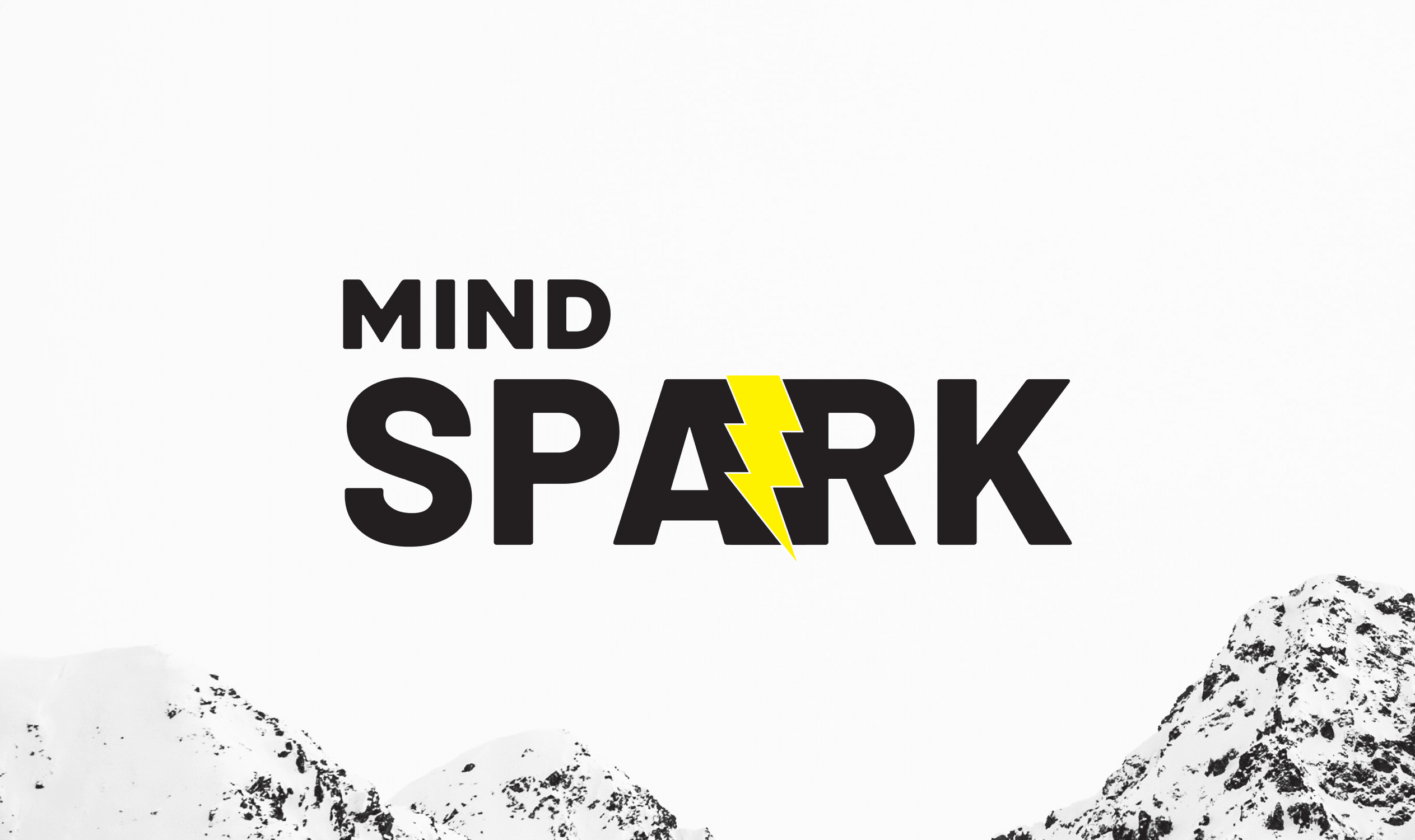
MindSpark is an ed-tech initiative created to ignite curiosity and make learning genuinely exciting for students from 2nd to 12th grade. Its mission is simple, to turn studying into something engaging, fun, and worth looking forward to
sECTOR
Education & Learning
cLIENT
Nextwave


MindSpark's color palette of yellow, gray, and green embodies its engaging and interesting online learning experiences. Vibrant yellow represents energy and enthusiasm, while sophisticated gray showcases professionalism. The secondary color green symbolizes growth and nurtures young minds.
Aligning with MindSpark's commitment to fostering intellectual development.
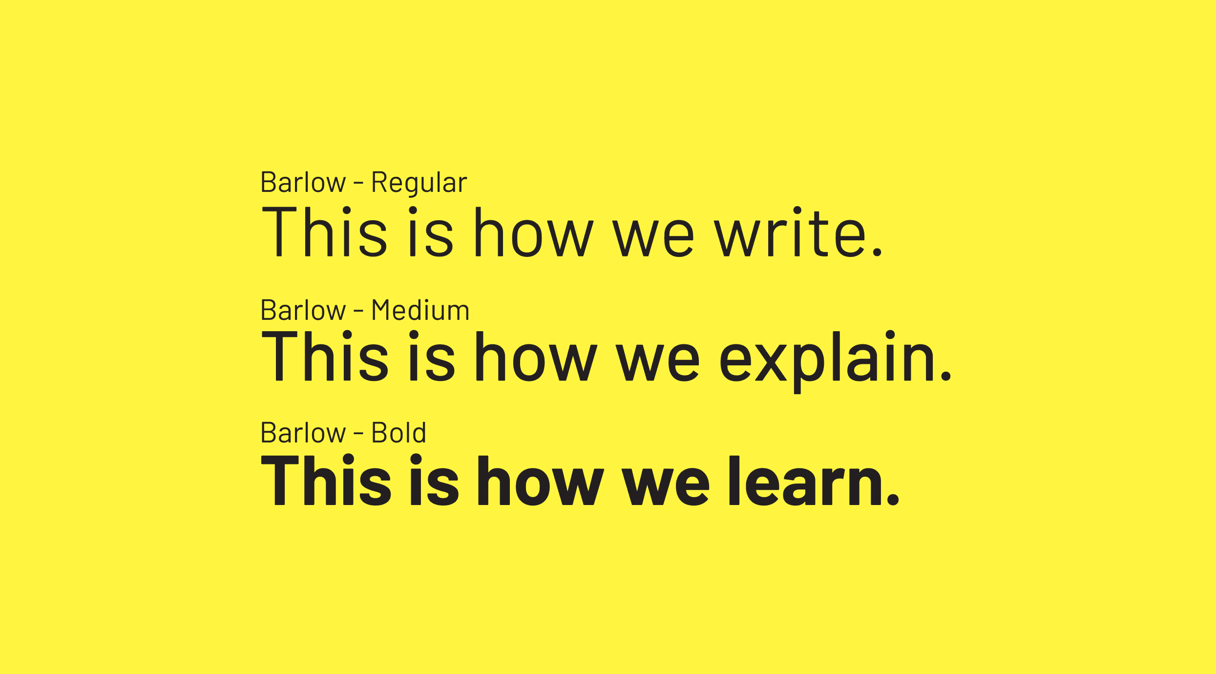
With its clean lines and legible letterforms, Barlow ensures readability across various platforms and media. The font's contemporary design reflects MindSpark's commitment to innovation and forward-thinking in the field of education.
Logo Design
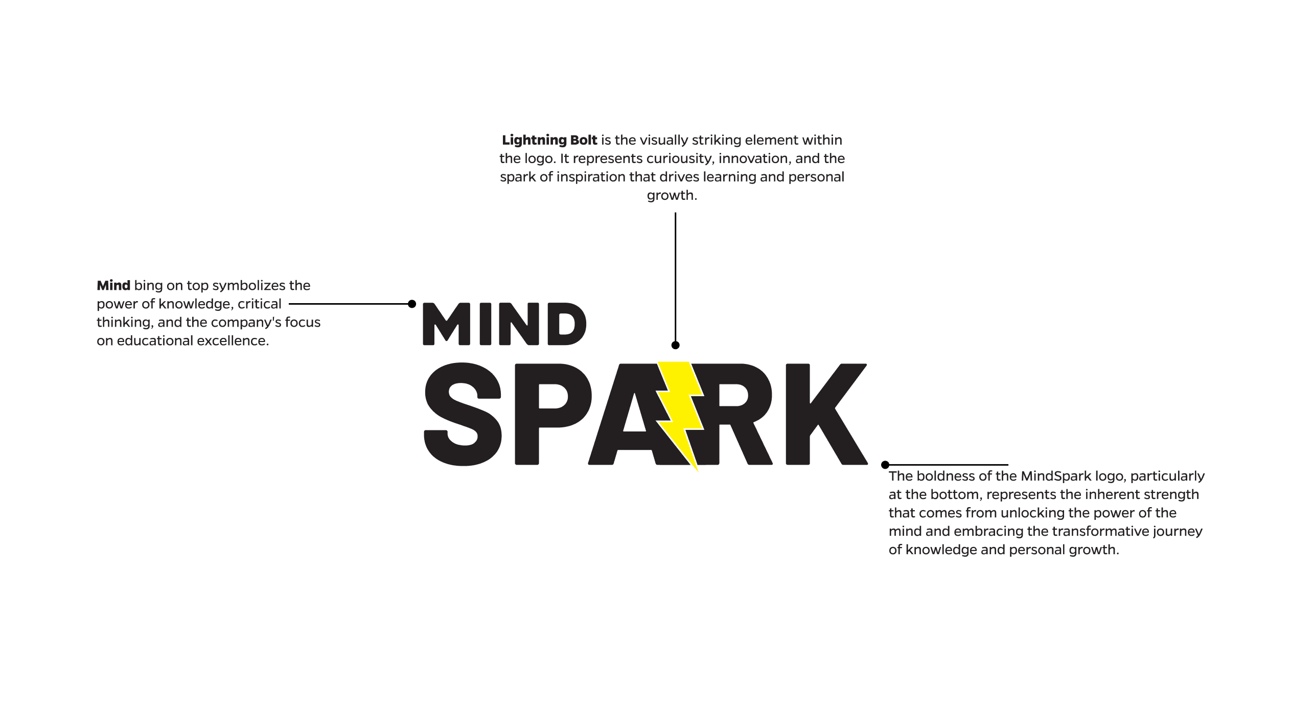
We designed a bold, flexible identity using the Barlow typeface, chosen for its clarity and strength. The split between “Mind” and “Spark” subtly nods to brain structure, with a spark icon highlighting curiosity at the core.
Forming the base for a system that scales across apps, classrooms, and beyond always built for clarity, inclusivity, and adaptability.
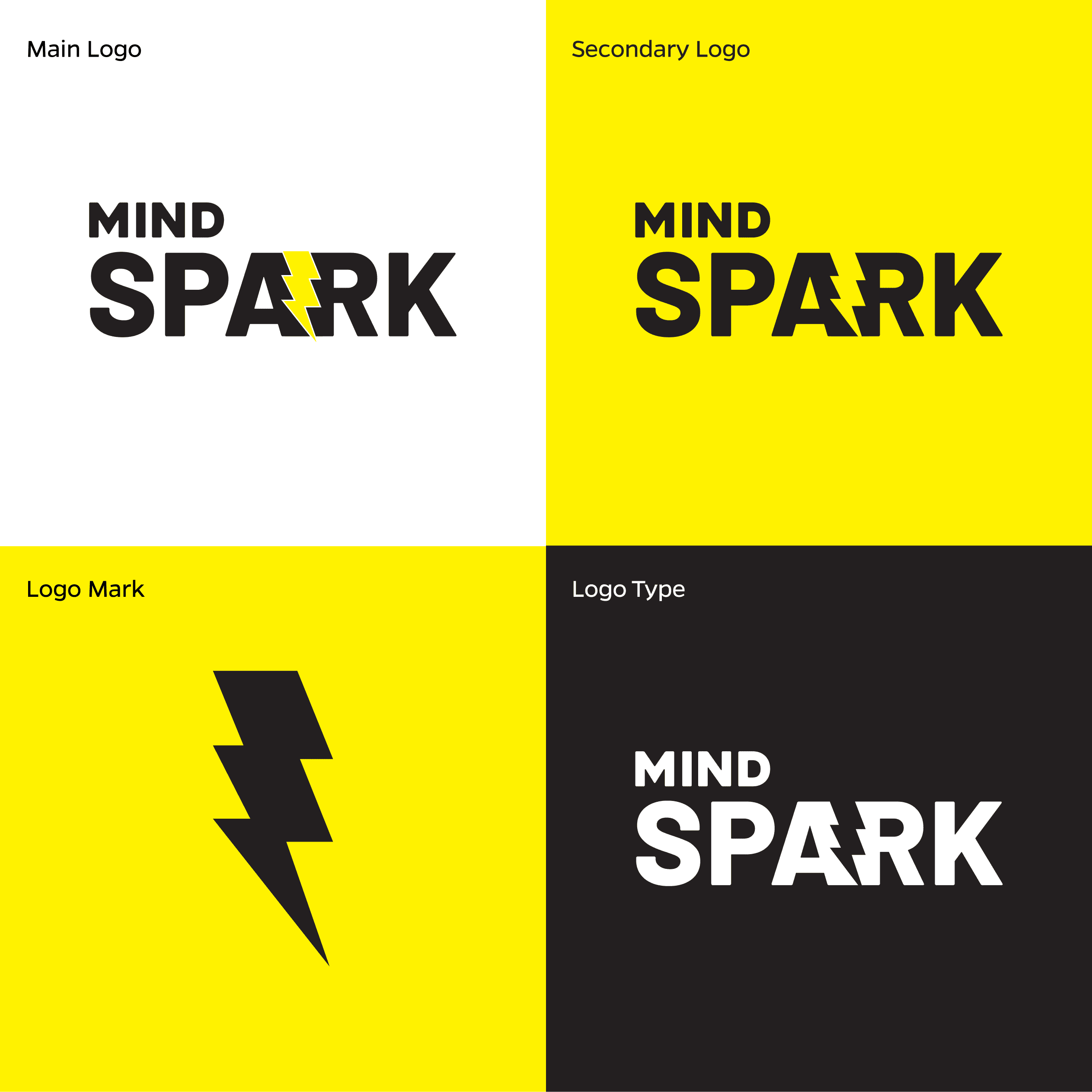
Logo Usage
We designed a bold, flexible identity using the Barlow typeface, chosen for its clarity and strength. The split between “Mind” and “Spark” subtly nods to brain structure, with a spark icon highlighting curiosity at the core.
Forming the base for a system that scales across apps, classrooms, and beyond always built for clarity, inclusivity, and adaptability.