

Brand Identity Design
Donec hendrerit, leo id convallis luctus, massa metus gravida quam, ut bibendum felis erat id enim. Phasellus id tellus sed erat posuere lacinia eget quis libero. Morbi pretium maximus nisi, ut pulvinar arcu rhoncus sit amet.
sECTOR
Health and Wellness
cLIENT
Eva Live India

About Blue Taza®
Blue Taza® exists to inspire creativity in everyone, making it the go-to coffee for those who need a spark of energy to fuel their ideas. We are dedicated to becoming a staple in every workspace, helping our audience stay in the zone, no matter where they are. Every cup is an invitation to explore new flavors and discover the joy of specialty coffee, simplified for your convenience.
The brand identity is bold, vibrant, and effortlessly accessible.
Brand Positioning
At Blue Taza®, we believe that a great cup of coffee can be crafted in countless ways. So, we’ve tossed aside the rulebooks, the jargon, and the complexity, and instead, we’ve taken everything we love about specialty coffee and made it simple allowing you to enjoy it at your own pace.
Blue Taza® is dedicated to inspiring creativity in everyone. Our brand positioning reflects the creative potential within individuals, helping us connect with our target audience by empowering them to get in the zone.
color palette
Primary Colors
Blue Taza®’s serene blue symbolizes clarity and endless possibilities, fostering a clear mind for innovative thinking. Blending perfectly with our Gray giving it the sense of professionalism. This combination should only be used on white background to maintain visibility
Secondary Colors
Our carefully curated color palette is a reflection vision and values of Blue Taza®. The rich tones of red and brown evoke the natural essence of cofee farms. These colors symbolize the warmth of roasted cofee beans, grounding our identity in authenticity and heritage. Adding to this, the earthy hues of muted green and brown embody a sense of energy, optimism, and our deep connection to nature and sustainability.


Type & Text
The typography for Blue Taza® reflects its approachable, fresh, and modern brand personality. The chosen fonts ensure readability while adding character and warmth to the brand’s communication.
Primary font
Hanken Grotesk
Type
Sans-serif
Usage
Headlines, subheadings and prominent text
Secondary Font
P22 Mackinac
Type
Serif
Usage
Body text, supporting element, and storytelling
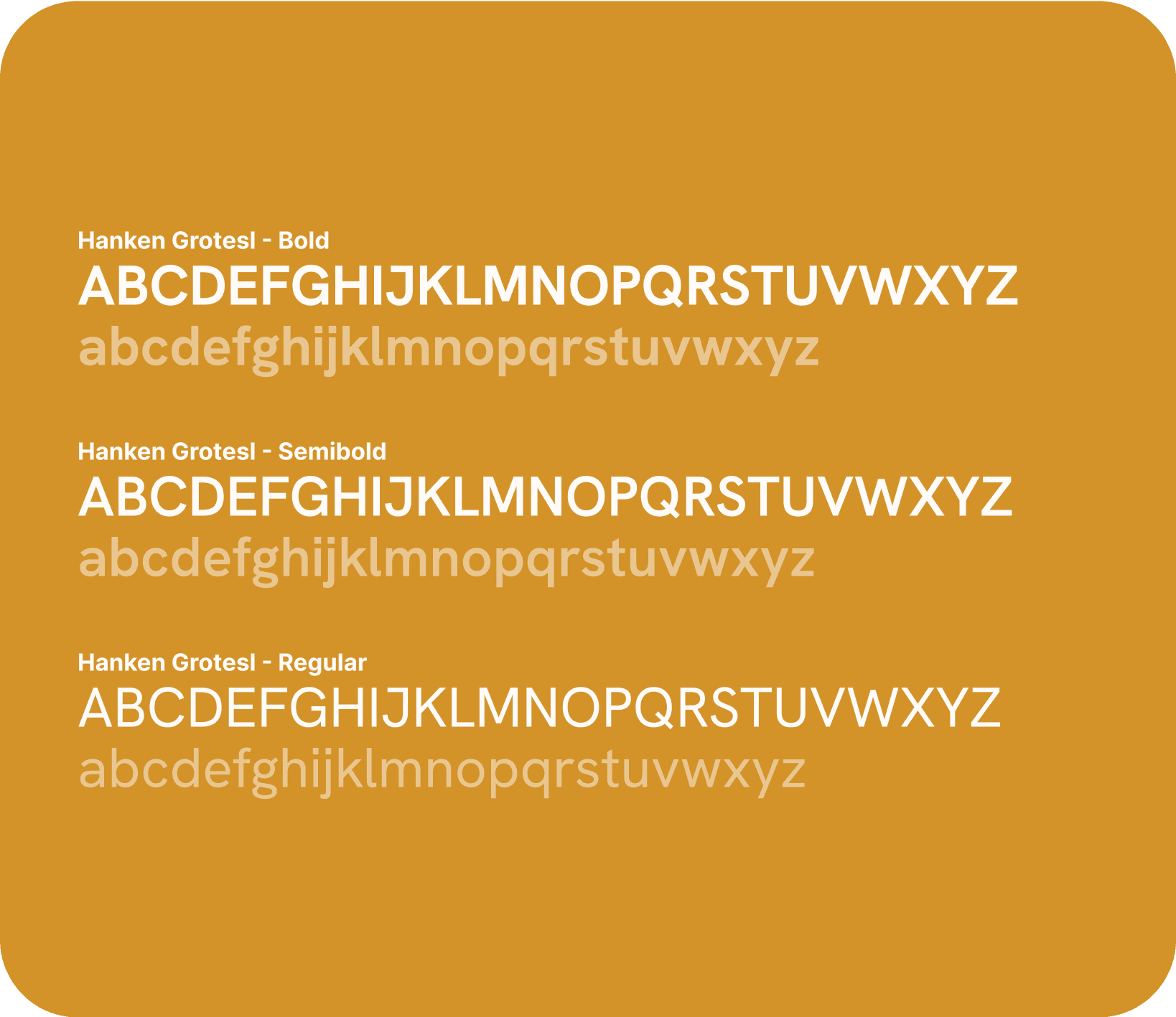
Hanken Grotesk
Clean and modern, ensuring clarity and readability.
Balanced geometric design that aligns with the brand’s fresh and accessible identity.
P22 Mackniac
Elegant and sophisticated, adding a touch of refinement to the brand.
Warm and friendly, perfectly complementing the primary font for a cohesive aesthetic.

Illustration
The art style for Blue Taza is rooted in authenticity, creativity, and simplicity. It incorporates hand-drawn elements with organic strokes, creating a sense of warmth and approachability. This hand-crafted style reflects the brand’s commitment to creativity and the personal touch that goes into every cup of coffee.
To highlight its commitment to creativity, Blue Taza collaborated with nine different artists to design unique variations of the logo, each reflecting their individual art style.


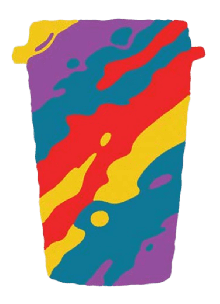
Brand patterns
Blue Taza’s brand patterns blend bold, creative visuals with delicate, organic touches. These designs capture the brand’s dynamic personality, seamlessly fusing modern aesthetics with the lively spirit of coffee culture. The primary palette of soft blue and white creates a clean, fresh look, complemented by warm coffee-inspired brown tones as the secondary accent.

Patterns enhance product boxes with a cohesive, vibrant aesthetic.


Morbi vitae vehicula purus. Sed vestibulum risus in magna efficitur, nec porttitor mauris scelerisque.
Social Media
Engages audiences with bold, recognizable visuals.
Marketing Collaterals
Consistent brand presence across brochures, ads, and digital platforms.
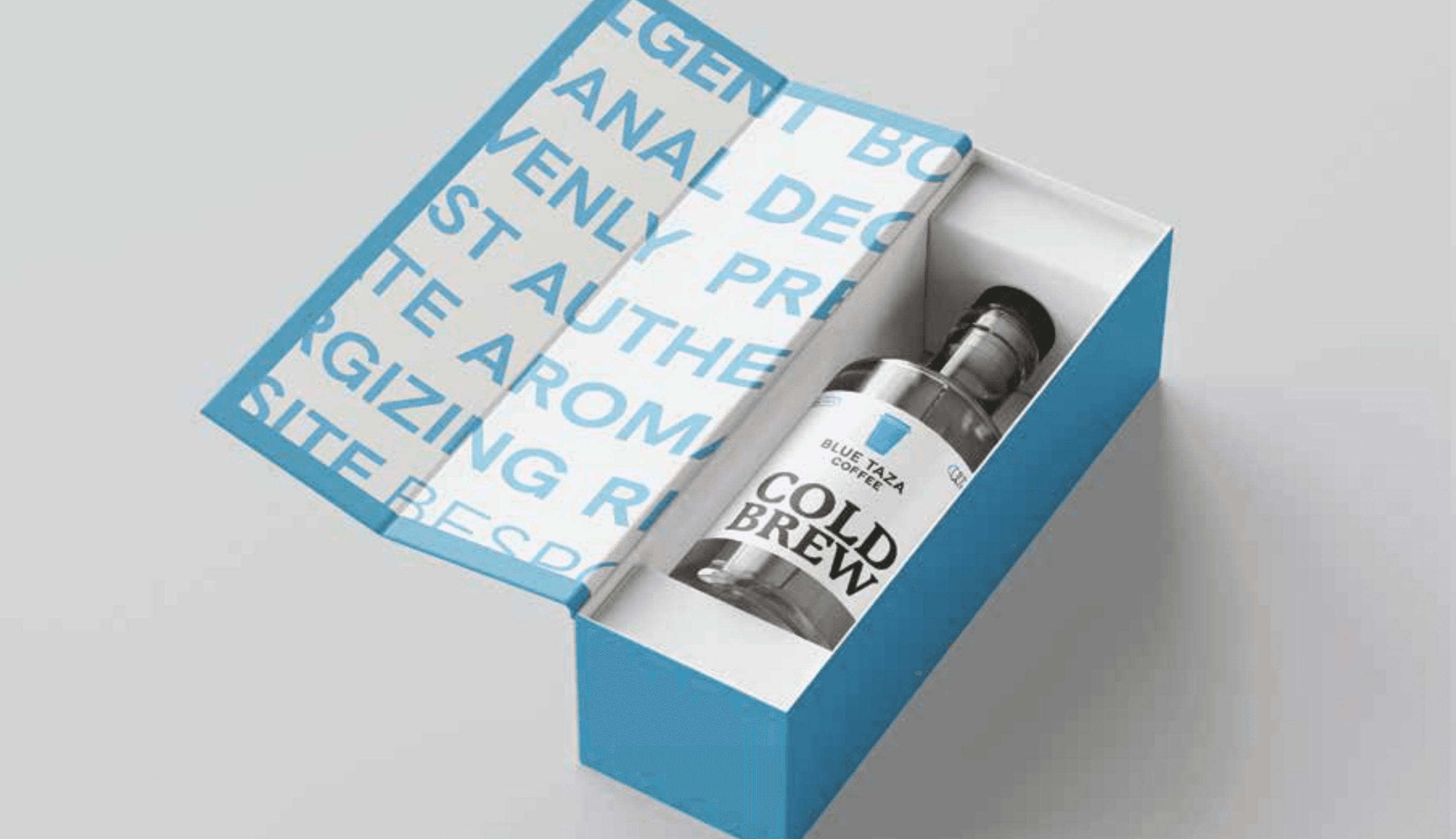
Packaging Design
We use mono shades of color is used to represent each flavor. This color-coding system helps create a visually cohesive design, offering customers an immediate connection to the coffee’s flavor profile. The monochromatic approach ensures that the packaging remains clean, modern, and easy to recognize, while subtly highlighting the unique qualities of each blend.

Blue Taza® Blue
Original Flavor

Blue Taza® Amber
Caramel Flavor

Blue Taza® Dark Clay
Hazelnut Flavor


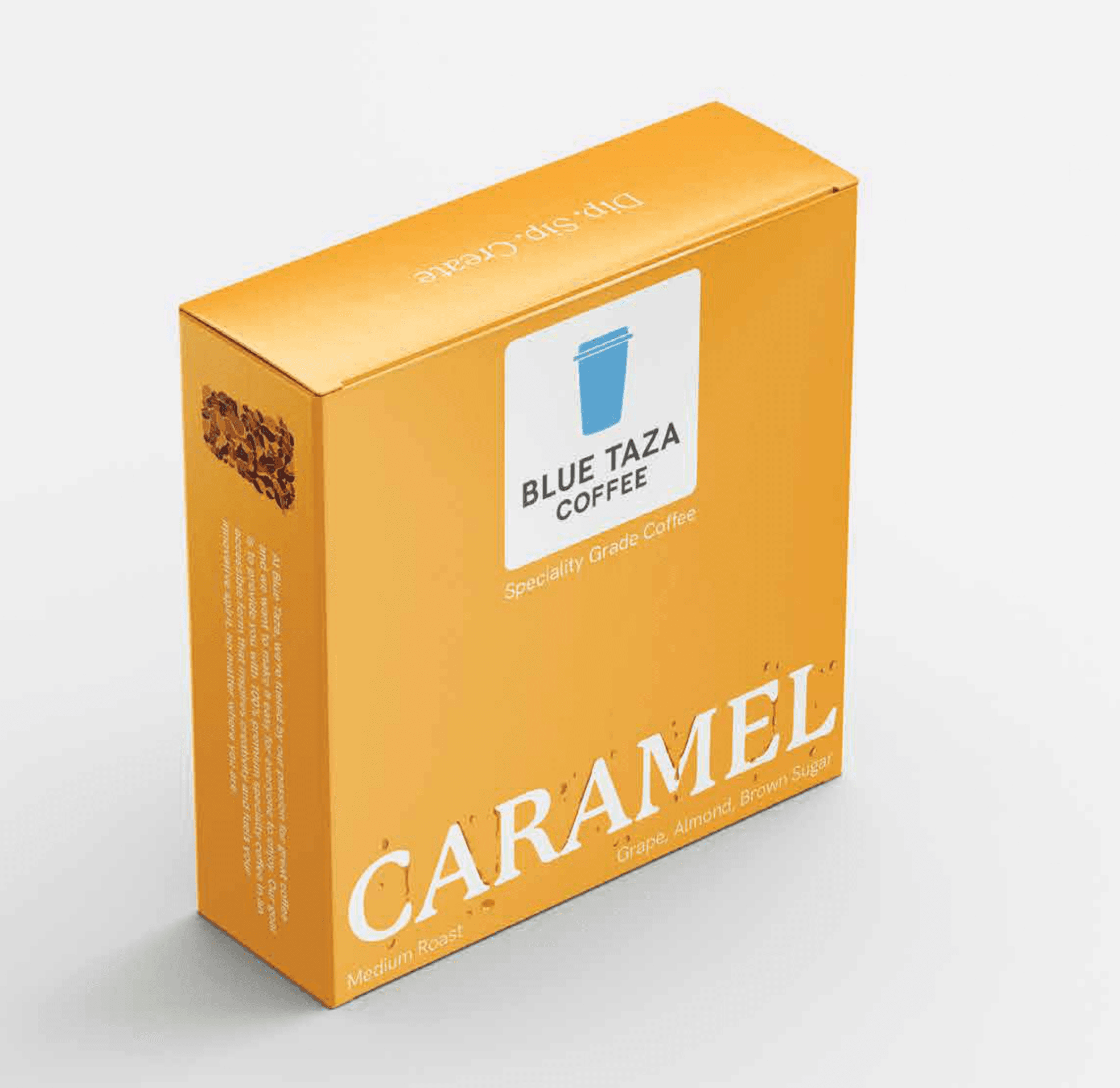

Packaging Typography
The flavor illustrations, wrapped around the text, add personality and visual interest to the packaging. These hand-drawn illustrations reflect the essence of each flavor, offering a creative and intuitive representation of the taste experience. Paired with clear, concise text, the illustrations create a dynamic balance between design and communication, making the flavors easy to identify while reinforcing the playful, yet sophisticated, identity of Blue Taza.

Social Media Design
At Blue Taza, we blend the worlds of art and real-life photography to create visually stunning and engaging content. Our social media showcases drinks made with Blue Taza cofee, paired with hand-drawn art elements and immersive visuals that highlight the diversity of our product range.
Each post is crafted to reflect our brand’s vibrant colors and creative energy, bringing our coffee to life in unique ways.
From bold illustrations to authentic photography, every piece of content celebrates the joy of specialty cofee, making it accessible, exciting, and unmistakably Blue Taza.