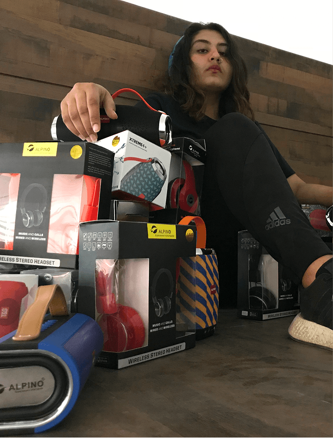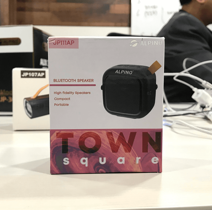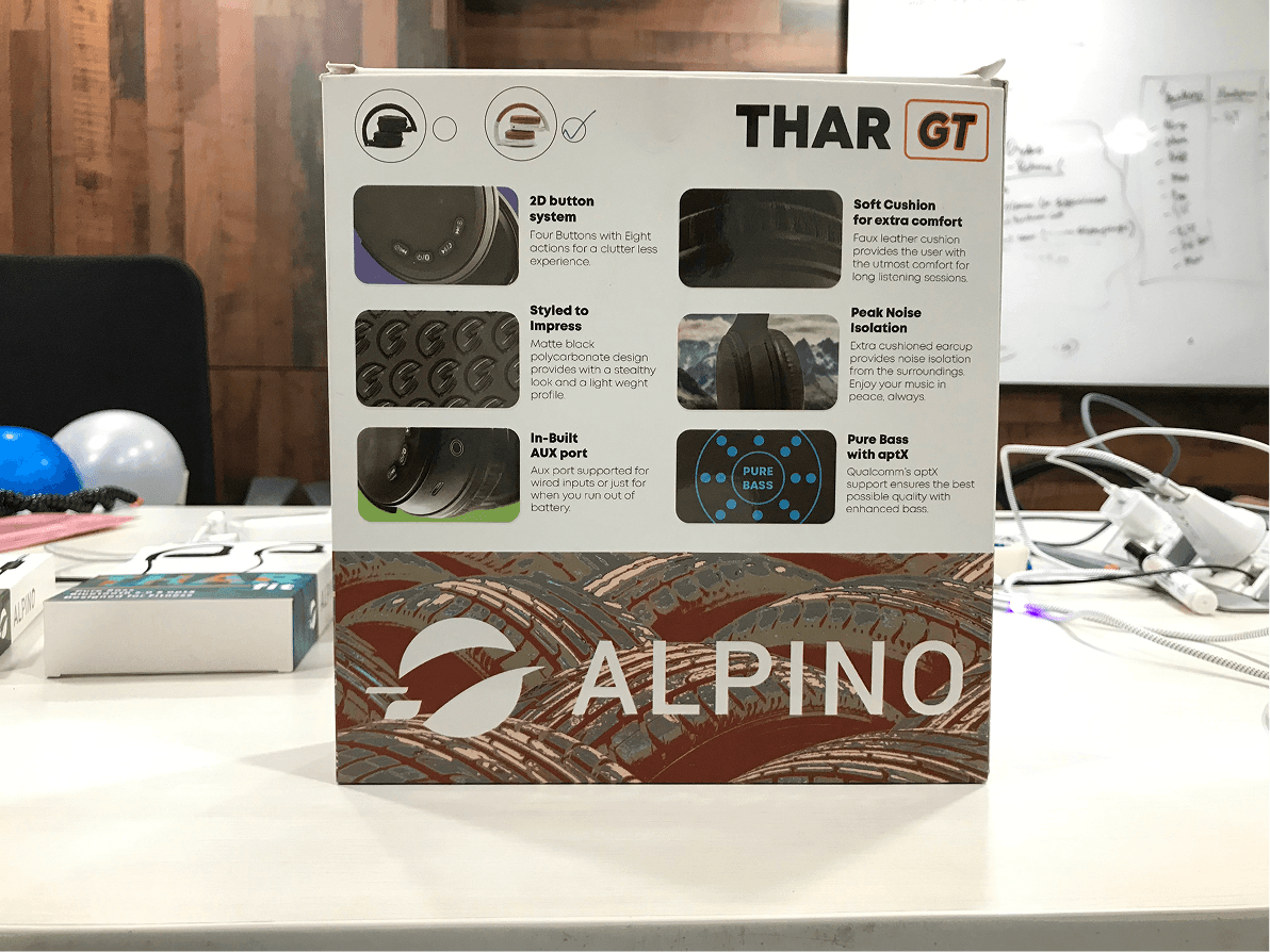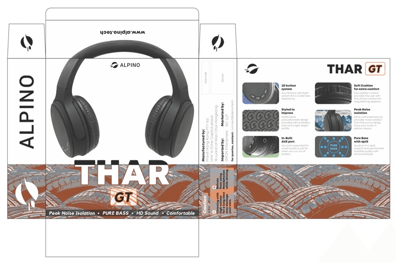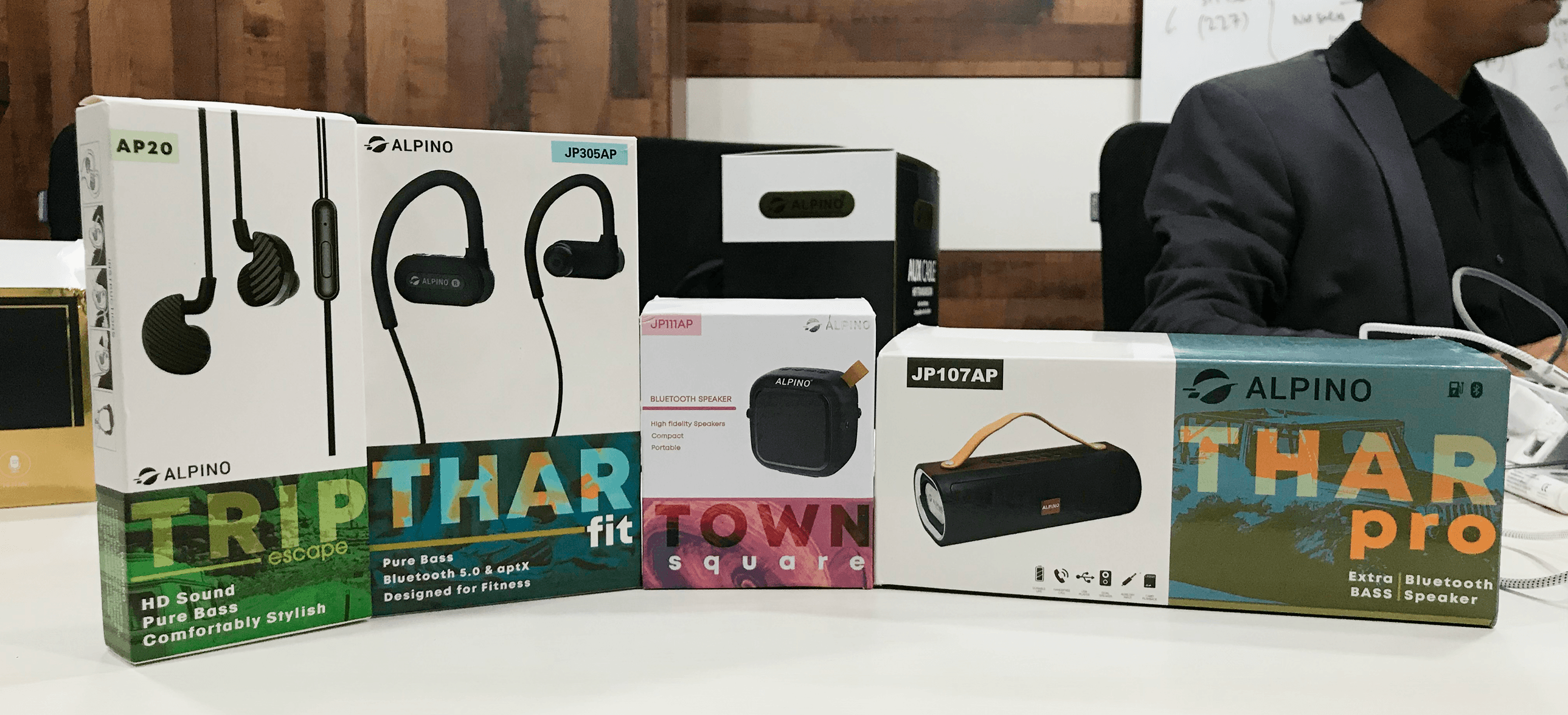

PACKAGING DESIGN
For Alpino.Tech, the goal was simple: bring personality to audio gear without compromising on clarity. Each product from the bold THAR GT headphones to the compact Town Square speaker got its own graphic language while staying unified under one brand voice.
sECTOR
Tech
cLIENT
Alpino Tech
The visual system leans on expressive typography, textured patterns, and color-coded SKUs that help with shelf recall. Form factors were considered early on dielines informed layout decisions so key specs, feature icons, and branding are always front and center, no matter the box orientation
The Trip Escape earphones went minimal with a bold green band and product-forward photo layout, while THAR Max packaging played with contrast and metallics to signal premium positioning. The system was built for visual hierarchy and quick consumer decision-making — but without losing the excitement you feel when unboxing something new.